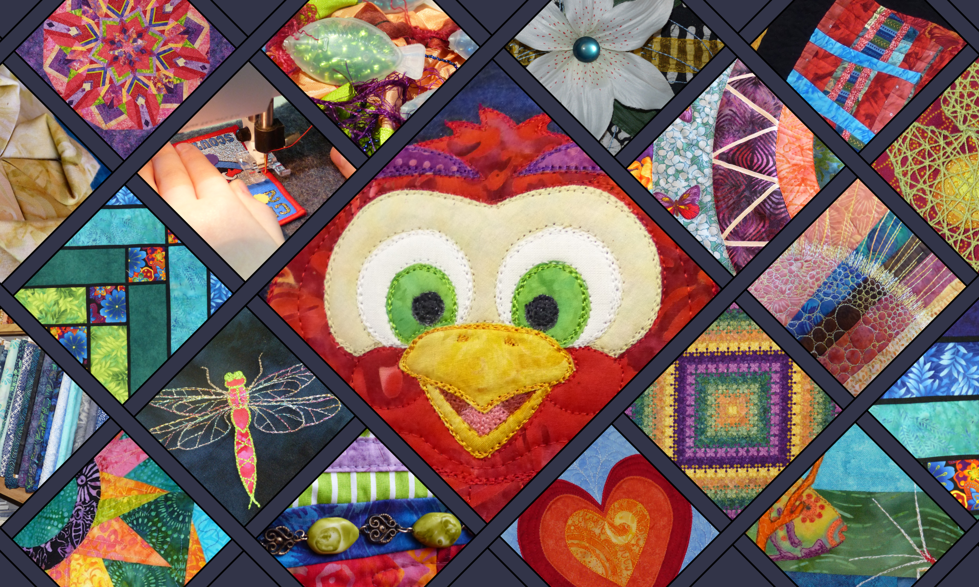

Becoming an expert in colour value contrast will help make your quilts stand out from the crowd.

Last time we talked about how contrast is the key to producing an eye-catching quilt. If you missed that post, you might like to read my comprehensive overview of the types of contrast to consider when thinking about your next brilliant quilt. Today however, I want to start to elaborate further on just one of these types of contrast – using colour value contrast to give your quilt designs a facelift!
Colour value contrast is a quilt design fundamental you should master EARLY. Possibly even before the perfect 1/4″ seam……..!!
What is the very first thing you think of when I say “Add some contrast to your quilt.”? I bet your first response is something about using “light, medium and dark coloured fabrics”. This is colour value contrast.
Why do I think you will likely choose this form of contrast first and foremost, even though there are dozens of other ways to introduce contrast into a quilt? (And even though you’ve read my last post, right?!) It is because colour value contrast is one of the most fundamental design concepts used in great quilts. If you like looking at other people’s quilts, it is a concept you have already seen in action, possibly hundreds of times. We’ve all heard about it…. but do we really understand it? Let’s investigate and make sure…..
What is colour value and colour value contrast?
Colour value is defined most simply as the relative lightness or darkness of a colour (read “fabric”!). So, there are two parts to colour value:
- the properties of a colour, and
- the colour’s context.
A colour can be described as light, dark or medium. Really light and really dark value colours are fairly straight forward….. they tend to look light or dark in any context. However, medium value fabrics are more tricky. They have a habit of looking light next to dark fabrics and dark next to light fabrics. And these tricky fabrics are generally the ones that quilters buy in great lengths and hoard in stash. Because medium value colours are the most attractive.
However, as pretty as these fabrics are, if you only use medium colour value fabrics in a quilt it is very difficult to produce a “WOW” design. This is why you need colour value contrast. Effective colour value contrast is the art of using a range of colour values to create a design that is well-defined, pleasing to the eye and interesting to the brain.
Why is colour value contrast so important?

If you pick up a recently written quilt book , chances are that somewhere in the introduction there will be a short section about choosing fabrics. And in this section, you will be reminded to choose fabrics covering a range of colour values. If you’ve ever joined a class to sew a particular quilt pattern, I hope you’ve heard it there too. And you’re hearing it again here! This is because it is great advice and if you do not heed it, you will get a disappointing result. You will wonder why your quilt doesn’t capture you like the demonstrator’s/pattern’s example did.
Have you ever wondered why a quilt you’ve made looks flat, boring or dull; even though you used really really beautiful fabrics in colours that you love?
You might have wrongly assumed that it is because you can’t sew as well as “her”, or that you are just not talented enough at choosing fabrics. If you inner voice tries to tell you this, it is wrong, wrong, wrong! – You just need to get a better handle on using colour value contrast! If you are the victim of a boring quilt, the most likely culprit is that you have used too many fabrics of the same or similar colour value. Even if the actual colours are all different (ie red, blue, green etc) they can still be much the same value. The easiest way to see if this is the problem is to stand a good distance from your quilt. If the pattern disappears as you move away, you do not have enough colour value contrast.
Using different colour values properly in a quilt creates visual depth and adds definition to the design. Colour value contrast also changes the way the brain perceives colours – dark fabrics make mid colours appear brighter, while light fabrics make mid colours appear more intense. Colour value contrast causes people to notice those beautiful fabrics you’ve invested in and to see the fabulous layout of your pattern. It makes your quilt eye-catching.
Ok, so I can see that mastering colour value contrast would help me grow as a quilter…… What can I do?!
Like anything else, becoming proficient at choosing good fabric combinations takes practise. Try some of these suggestions:
- If you have a stash, play with your fabrics to make colour combinations you like (you could use scraps to do this too). First, choose a couple of medium value fabrics that you really like together. Now find several more fabrics that look good with these Concentrate on making sure they are noticeably lighter or darker than your first choices. You may actually find that your stash is pretty short on light and/or dark fabrics….. you won’t be alone in this, it is quite common, and a good excuse for shopping!!
- Find out more about how expert quilters use colour value contrast….. Attend a quilt show and deliberately look for the colour value contrast in your favourite quilts. Or read more about how colour value is used in quilting. You may like to read my article: Six ways talented quilt designers use colour value.
- Find out more about colour value theory. Knowledge is power! My quilting perspective on this topic is collected here for you in: Colour Value Theory for Quilters: What you need to know!).
 Practise, practise, practise!
In the meantime, look around you as you go about everyday life and notice colour value contrasts. Train your brain to see where colour values are used to create interest. Whether in the supermarket, reading a magazine, or relaxing at the park, be “contrast aware”. You might be surprised at what you see that you didn’t before!
P.S. If you found this article helpful, please feel free to pin and share as long as you include attribution to Dione Gardner-Stephen and the correct Clever Chameleon URL. Thanks!
P.P.S. I know some tricks you can use to rescue boring quilts suffering from lack of colour value contrast. Comment if you are interested in a post about this!
