Colour Inspiration Tuesday: Ice-cream Tones

Ice-cream Tones color scheme by Clever Chameleon

Colour Inspiration Tuesday: Helping you find amazing colours for your next quilt. 

Welcome back to Colour Inspiration Tuesday! And an extra warm welcome to you if you have arrived here via the Stitched in Color blog and have joined us at Clever Chameleon for the first time. Here we explore colours with patchwork and quilting specifically in mind, although the colours also work for any other creative project you might be planning of course. This week we are going to have a bumper week. Today we will explore ice-cream tones, later in the week I am planning to investigate the colours of buried pineapples, cocktails at dusk and flamingoes in the swimming pool! Intrigued? I hope so!

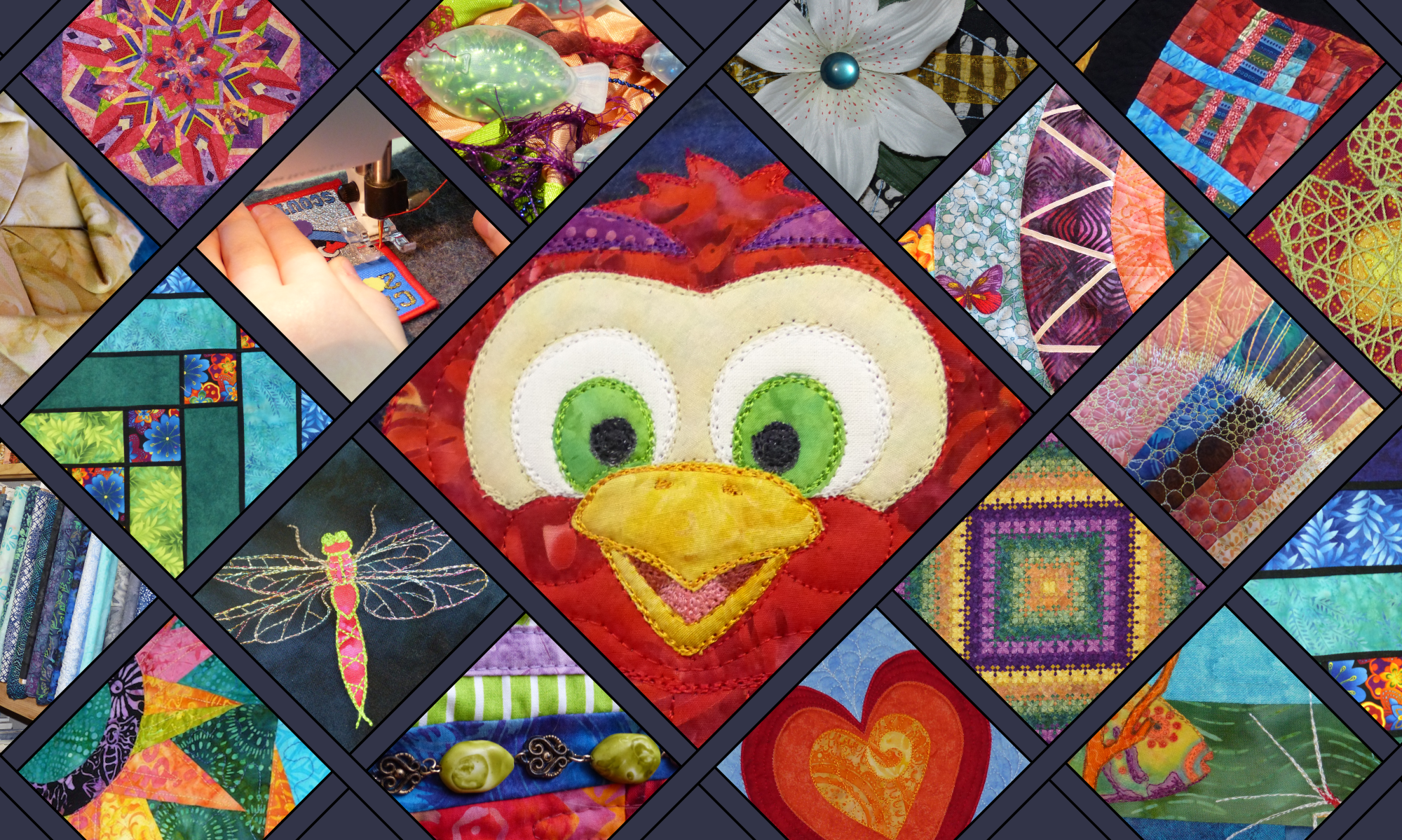
This week we are approaching the exploration of our quilt colours just a little bit differently to usual. Because we are joining in the Stitched in Color’s Summer Crush mosaic contest! Yay!!

Not too long ago I discovered the absolutely beautiful Stitched in Color blog. It resonated with me immediately, especially the colour mosaics you can find here. Rachel writes: “Slow down a minute, my friend, and ponder with me in color.” What a wonderful sentiment. Ever since discovering her page, I have been waiting for a chance to join in the mosaic fun.

One of the reasons why I am so keen to link in with the mosaic contests is because it takes what we do here at Clever Chameleon – choosing a photo, generating colour schemes (or mood boards), and thinking about their uses in a quilt – and moves it into the world of real fabrics. A bit like I did with Jewel Tone Triangles a while back. Today, the fabrics in question are the pretties of the luscious Quilt Sandwich Fabrics shop on Etsy. It makes us work within the confines of what is available today, from one source. This is a helpful skill to practice!

Colour Inspiration Tuesday: Ice-cream Tones

So, back to the matter at hand. Like every other colour palette so far, I have started with an interesting photo from Unsplash.com. This week I focussed on summer-themed photos, and came up with a small short-list of candidates (the contest allows two uploads per participant). To kick us off, we are going to look at ice-cream. Not many things yell summer louder than ice-cream, right?!

The “Ice-cream Tones” colour scheme is yellow, pink and brown. It evokes thoughts of hot days, cold treats and berry flavours. I emphasised the darker pink in my mood board because my favourite summer treat is a frozen yoghurt from the Copenhagen Ice-creamery, which has a dark berry puree swirled through! Delicious!

I would recommend using the dark brown colour as a contrast highlight. Just enough to make the yellows and pinks really shine. I would also add a lot of white to a quilt in these colours, to preserve the clean, light brightness of summer days. 

What to create with the Ice-cream Tones colour palette?

Lately, at this point in each post, I have been adding a visual quilt idea or two for you, based around the colours in  the day’s colour palette. But that’s where this week is different. Today we will be matching fabrics to our colour palette instead. You can do this with any colour palette and your favourite online fabric store, anytime. Great, isn’t it?!

Firstly, I went through the fabrics on offer at Quilt Sandwich Fabrics, the contest’s sponsors. Here are the fabrics that I initially pulled out. 

Ice-cream Tones fabrics first pass
My first pass at selecting Ice-cream Tones fabrics from Quilt Sandwich Fabrics

Now, the rules of this contest say I have to narrow the selection down to just 9. Which nine would I most like to make a quilt with?! 

Here is my process…..

How I chose nine fabrics for an Ice-cream Tones project

My eye was caught by this fabric first – Direction in Yellow, an arrow print on a yellow background, from the Tropical Paradise collection by Josephine Kimberling for Blend Fabrics. 

Not only did it capture the colours of the Ice-cream tones palettes, but it also introduced purples for deep summer sunsets, and aquas and blues from the beach and the sky. All things that very much make up summer here in coastal Australia.

To make sure the aqua, blue and purple sit well in my collection I added 2 more prints that use these colours. The bike sign print (From the Ride collection designed by Julia Rothman) was a seriously good find! My hubby and I and the kids cycle a lot, all year round, but especially in summer. And then the feathers (From the Tsuru collection by Rashida Coleman-Hale for Cloud 9 Fabric). I added this fabric because I love it, and because no summer walk around our local wetlands is complete without collecting feathers.

The next step was to make sure there is enough dark contrast and larger scale print in my collection. So I added the pink daisies on the brown background (Daisies and stems in lilac, magenta, olive and lime on a brown background. Designed by Tula Pink for the Acacia collection by Free Spirit Fabrics). Daisies are definitely very summer.

Ice-cream Tones colour scheme from Clever ChameleonI then went back to my colour scheme and emphasised the main colours with small scale print fabrics. Two pinks and two yellows of different colour values. To finish the collection I added a medium scale medallion print that has both pink and yellows as its main colours. It was designed by Keri Beyer for the Dream A Little Dream With Me collection by In The Beginning Fabrics. The circles remind me of the summer sun, but dreams also seem appropriate for summer.

This is what I ended up with. I hope you like it.

Ice-cream Tones colour scheme fabric selection by Clever Chameleon
This is my final selection of fabrics for my Summer Crush Mosaic: Ice-cream and Sunshine

Ice-cream tones color scheme from Clever Chameleon

What about the backing?

Well it’s not part of the contest, but I saw this little gem along the way. And I can say I would love to have this on the back. It is just too cute!!! And all the right colours too. It is covered in bright houses with a happy attitude and is from Timeless Treasures.

Back to some quick Colour Inspiration Tuesday formalities….

12 color schemes to try on your creative projectsSome information if you are new here today…..

Recently I put together our first colour scheme review. For a good introduction to Colour Inspiration Tuesday, you can find 12 colour palettes all together here.

Last week we looked at classic blues and greens in the Another World Blue colour palette. We also explored what the Cat on a Wall quilt pattern would look like if we used these colours instead of the Sunset Wall palette.

Follow the links to find out what we’ve been up to. And subscribe to emails to keep up to speed from now on!

Credit

Today’s photo of yummy ice-cream is from Unsplash.com. Unsplash is a collection of free, high resolution, “do what you want with” photos. Credit is not required, but I love to give credit where credit is due, and am always grateful to people who contribute to open source communities. So I would like you to know that this lovely photo was provided by Ian Dooley via Unsplash. Be sure to check out his collection of photos on Unsplash.com.
ian dooley

Clever Chameleon logo in brownFor colour inspiration for your quilts in your inbox weekly follow along by subscribing to this blog. Or follow Clever Chameleon Quilt Colour Inspiration on Pinterest and pin your favourite colour palettes to try later. 

P.S. If you would like to use Ian’s photo or another Colour Inspiration Tuesday photo for your own projects, you can easily find all the Unsplash photos from Colour Inspiration Tuesday in one place for free in my Colour Inspiration Collection.

Colour Inspiration Tuesday: Aurora Green

Aurora Green color scheme from Clever ChameleonColour Inspiration Tuesday: a free resource of colour combinations to try on your quilts.

Welcome to our first Monochrome Colour Inspiration Tuesday! I have noticed that quilters quite like monochrome or very nearly monochrome colour schemes.  And of these, green quilts are very popular. Among my Pinterest quilt inspiration boards I have one called Monochrome and Analogous Colour Quilts. And on this board it is typically the green quilt pins that receive the most attention. Green is a soothing colour, it is a great choice for a quilt.

To make an interesting monochrome quilt you need to pay attention to the colour value range. If there is not enough colour value contrast, a monochrome quilt will not have much visual interest. So, let’s look at a photo with a great green colour range: Aurora Green.

Aurora Green color palette by Clever Chameleon

Colour Inspiration Tuesday: Aurora Green

The “Aurora Green” colour palette isa range of seven greens – from pale yellow green through to a green so dark it is nearly black.

This colour range is sufficient to capture the glow of this beautiful photo in luminescent quilt designs such as Blooming Nine-Patch or Light in the Valley. See?

Simple Blooming Nine-Patch Layout using the Aurora Green colour scheme.

It also covers enough green colour values to make a geometric quilt with good clean lines of contrast between the design elements. Here is one fabulous example of a quilt that uses a similar colour palette to do just that. Hop over and take a look at this lovely blog post by Pie Lady Quilts.

link to Pie Lady Quilts

You can also check out my carefully curated Green Quilts Pinterest Board for more inspiration on how to use green in a stunning quilt.

One final idea: add a little pink and/or yellow as highlights to this colour scheme to make a fresh garden colour quilt. Play with these colours until they resonate for you!

Not into Green? Fair enough….

Blue Fox color scheme from Clever ChameleonRed-eye Flight color scheme from Clever ChameleonWhy not try some of the other colour palettes in the growing Clever Chameleon collection? Some popular colour schemes at the moment are Red-Eye Flight from a fortnight ago, and a calming blue and red-brown colour scheme called Blue Fox

Credit

Today’s very green photo is from Unsplash.com. Unsplash is a collection of free, high resolution, “do what you want with” credit-free photos. I am grateful to people who contribute to open source communities, so I would like you to know that this lovely photo was provided by Jan Erik Waider. Visit Jan’s photo collection here:
Jan Erik Waider

Clever Chameleon logo in greenFor colour and layout inspiration for your quilts in your inbox weekly follow along by subscribing to this blog. Or follow Clever Chameleon Quilt Colour Inspiration on Pinterest and pin your favourite colour palettes to try later. 

P.S. If you would like to use Jan’s photo or another Colour Inspiration Tuesday photo for your own projects, you can easily find all the Unsplash photos from Colour Inspiration Tuesday in one place for free in my Colour Inspiration Collection.

Colour Inspiration Tuesday: Jewel Tone Triangles

Jewel Tone Triangles color scheme from Clever ChameleonColour Inspiration Tuesday: a free resource of colour combinations to try on your quilts.

Hi – Welcome to another Colour Inspiration Tuesday! When I was first introduced to quilting, the group I met regularly with had a thing about fabrics in rich jewel-tone colours. Specifically, batik collections in saturated turquoise, sapphire, emerald, topaz, magenta and amethyst colours. These were good times, so these colours will always transport me back to the fun afternoons we spent sewing and eating and laughing.

Today’s colour palette was inspired by a photo strong in both geometry and colour. Because the purples, blues and turquoise reminded me of quilts in jewel-tones, we have “Jewel-Tone Triangles”.

Jewel tone triangles colour scheme from Clever Chameleon

Colour Inspiration Tuesday: Jewel Tone Triangles

The “Jewel Tone Triangles” colour palette is amethyst, sapphire and turquoise in several shades of each. These varying shades allow you to create depth, interest and even the optical illusion of 3D by using cleverly placed colour value contrasts.

It is very tempting to sit down and design a triangle quilt (or a tumbling block quilt) in these colours, using the colour transitions in the photo as a muse. I shouldn’t, due to time constraints…..

Of course, I did anyway …….. here is a free layout as an example of how you could use this colour palette (with two additional shades over and above the starting seven Jewel Tones) on a tumbling block quilt.

 Play with it until you find Your perfect combination. I just did!

I’m even tempted to make this quilt….. I could cut the diamonds with my GO! die. My daughter has spotted this post and said “Ooooo, I’d like that on My Bed”.  Not sure that I am going to make it bed-sized, if it happens at all. Perhaps she can aspire to have it on her wall…. I’ll let you know if this one gets to the top of the ideas queue. 

Update, this one is a goer – you can read about the start of the process here.

And read about my progress, including a tutorial on how to sew Y-Seams, here.

Don’t need rich geometry today? Try something more subtle.

There are several gentler colour schemes within the Clever Chameleon collection already….. why not take a look at Lily Pad Glow or Purple Tulip?

Today’s Photo Credit

Today’s stock photo is from Unsplash.com. Unsplash is a collection of free, high resolution, “do what you want with” photos. If you would like to also use this lovely photo, it was provided by Ferdinand Stöhr via Unsplash for license-free usage. Find more of Ferdinand’s photos here:
Ferdinand Stöhr

clever chameleon logoDon’t miss a post – follow along by subscribing to this blog. Or follow Clever Chameleon Quilt Colour Inspiration on Pinterest and pin your favourite colour palettes to try later. 

P.S. For your convenience, I have placed all the Unsplash photos from Colour Inspiration Tuesdays in one place. Find them easily for free in my Colour Inspiration Collection.

Colour Value Theory for Quilters – What you need to know!

href=”https://www.pinterest.com/pin/create/button/”>

Colour value theory for quilters cover image

Understanding colour values for quilters – the good, the bad and the very pretty!

So far, we have have talked about how contrast is the key to producing an eye-catching quilt, and more specifically about ways that colour value contrast can be used in a good quilt design. But, what if you have never really thought about art basics before and are a bit sketchy on what colour value is and how to determine it? No problem! Today we are going to look at what colour value is, and how it applies to quilters.

Let’s explore the concept of colour value from a quilter’s perspective…… because paint mixing theory isn’t that helpful to us textile-sewing-person types……

Colour value definition

Colour Value is defined most simply as the relative lightness or darkness of a colour (read here, “fabric”!). The extremes of this continuum are black and white. All other colours lie somewhere in between the maximum darkness of black and the minimum lightness of white. Colour value is very easy to see in a grey scale or in a monochrome colour series. Here are some easy to spot colour value graduations:

Colour value graduations in black, red and blue.
Three colour value graduations in black, red and blue. The middle colours in the red and blue scales are pure colours, without black or white added. These are known as hues, The colours on the left of the  hues are shades (hue + black) and the colours on the right are tints (hue + white)

Colour value is relative

The colour value of your fabric is relative to other fabrics or items around it. This is a really important fact! This means that whether a colour (fabric) appears to be dark or light can depend on the colours (fabrics) surrounding it. While white will always appear light and black will always be dark, colours closer to the middle of a colour range can appear light next to really dark colours or dark next to really light colours.

This is both great and not-so-great news for quilters. It is great, because it means that it is not necessary to use the extreme values of a colour to achieve good contrast in a quilt. A pastel quilt with a few well-placed mid-tones can look just as awesome as a vibrant quilt with saturated colours and a few dark highlights. Look at the image below. Both of the panels contain good contrast, even though they only cover a small subrange of colour values.

Teal fabrics showing a range of values.
Note: the light and medium fabrics in the lefthand picture are the exact same fabrics as the medium and dark fabrics in the righthand picture.

Colour Value can be complicated……

This relativeness of colour values is also “not-so-great” because you need to understand the relationship of colours with each other to understand how they will look together. This is tricky, but remembering that colours will appear lighter next to a dark colour and darker next to  a light colour will help avoid nasty surprises. Apart from this, the best method of working out “what works where” in a quilt is often trial and error, even for seasoned quilters. For this, I find a design wall is extraordinarily helpful. If two fabrics or blocks affect the appearance of one another, it’s nice to know before you sew! Experience and practice are also the best antidotes if you suffer a lack of confidence in this area. 

Repeated blocks on a quilt
Quilts made up of simple repeated blocks can take time to lay out until you are satisfied.

When I am making a quilt with lots of repeated blocks in varied fabrics, I always do a trial layout of my quilt blocks on the floor or a wall. Some layouts will always be more visually appealing than others, partly due to colour value distribution. There are usually lots of nice layouts, so it is silly to choose a jarring one that will disappoint you just because you didn’t experiment a little with block placement. And don’t stress about getting the “right” layout. There will be lots of great combinations. Just choose one you like.

So, remember: the Colour Value of a fabric (or even a whole block) is simply how light or dark that sucker is. But this is always assessed in the context of surrounding fabrics.

That’s pretty simple right? Right!

Where it gets trickier now, is to start thinking about how to determine the relative colour values of fabrics of unrelated colours. That is, between tints and shades of different colours (hues) rather than of the same hue. And then there are tones…… OK, I am thinking we should quickly define hues, tints, shades and tones before we go any further.

Hues, Tints, Shades and Tones (only the stuff that is helpful to quilters)!

Hues, Tints and Shades

portion of a colour wheel
Colour wheels have far more than the 6 colours you learned at school!

A hue is a pure colour that has not been diluted with white or black. Hues are what we generally think of as colours, and are usually found on simple colour wheels. Blue. Red. Green. Yellow etc. For this exercise, let’s pick one. Let’s say this Purple.  Now, a tint is the same purple, but with some white mixed in – or in terms of fabric, most likely with less dye applied to the white background fabric. One example tint of the the original purple is this purple. On the other hand, a shade is also the same purple, but with some black mixed in. An example is this purple. This colour may be created on fabric by mixing the original purple dye with black dye.

You need to remember that adding white or black doesn’t change the colour (hue), just its relative colour value (lighter or darker). It also decreases the colourfulness (because the colour is diluted by the black or the white).

Tones

As for tones, I’ll let Google explain…..

“A tone is produced either by the mixture of a color with gray, or by both tinting and shading. Mixing a color with any neutral color (including black, gray and white) reduces the chroma, or colorfulness, while the hue remains unchanged.”

colour wheel explaining colour value theory
GIMP software colour wheel, showing you all the tints, shades and tones of a particular red hue.

The best illustration I can think of is the colour wheel in GIMP software. The triangle in the middle of the colour wheel points to the selected colour hue. The colour graduation along the edge between the hue and white (the lower edge of the triangle) covers all the tints of the hue. The colour graduation along the edge between the hue and black (the uppermost edge of the triangle) covers all the shades of the hue. Every other point within the triangle is a tone of the red hue (ie has some red, some white and some black in it). Except, of course, the leftmost edge of the triangle. This edge is actually a pure grey scale and has no red in it at all.

Comparing colour values between your fabrics

Comparing colour hues

Let’s now go back to talking about comparing value between completely different hues. For example – a shade of yellow vs a tint of green. As I mentioned before, this is where things get a lot more tricky – where a lot of books stop helping you, and a lot of quilters lose their confidence. 

Hues have colour values relative to each other, just as the tints and shades of one hue can be compared. Pure yellow is not as dark as pure blue. Unfortunately, it is harder to judge value relationships between hues than it is within a hue family. And of all the colours, colour value relationships between bright hues are the hardest to judge.

Bright hues for comparison
Seven bright hues chosen from the pure colour wheel. The lightest is the yellow. But what order should we put the rest in?

Comparing colour tints, shades and tones

It is a bit easier to compare tints, shades and tones of different colours. This is probably partly to do with two facts: they are easier to look at, and they are closer to grey. If they were all grey, it would actually be relatively simple to order them.

Tints, tones and shades - colour value
Here are the same seven hues from the above picture, but they are softened. Top row: shades (hue + black), middle row: tones (hue + grey), bottom row: tints (hue + white).

To illustrate this, chose one of the tone/tint/shade families above and think of each colour as a grey. Now can you order them? Maybe, maybe not, but you will probably get further than if you try the same exercise with the pure hues.

Now try squinting at them (or decreasing the brightness on your device’s screen). This cuts down the amount of light entering the eye, and allows the rod-shaped light-sensing organs in your eye to predominate over the cone-shaped light-sensing organs. This is a useful trick because rod sensors don’t detect colour, only the cone sensors do. (This is also why at night everything appears to be various shades of black and white and grey).

You are now using grey as a comparison point; a visual anchor. The closer these colours appear to grey, the more monochrome the series becomes and the easier it is to deal with.

Fabrics in the real world are usually multicoloured! HELP!

Fabrics showing a decrease in the scale of the flower print from left to right.
Flower print fabrics (and one batik) in order of scale. The fabrics on the left have large scale motifs. As you move right the flower motifs get progressively smaller in scale.

On top of all this, we need to know how to compare fabrics that aren’t all one colour!! Very few quilters exclusively use solid single-colour fabrics all the time in every quilt. Perhaps a few hardcore modern quilters do; but most of us use a variety of fabrics over time, including prints and batiks. So, we will have additional challenges in determining the value of these fabrics.  There some extra things to keep in mind when thinking about the value of these fabrics.

What to remember when considering the colour value of fabric prints

  • Mottled solid fabrics (also known as textured solids) are nearly as easy to categorise as plain solid colours. The colour value of these fabrics is the average of the colour across the surface. Stand back from these fabrics and the colour variations will blend together. The overall colour you see tells you the overall value of the fabric.
  • Small scale prints/batiks behave similarly to mottled solids. A small red print on white fabric will look pink from a distance. A small black motif on white fabric will look grey. Unless you are fussy-cutting these into tiny hexies, treat them like mottled solid fabrics and visually “average” the colour value.
  • Large scale prints need to considered much more in light of how you are going to use them. If you cut a large scale print into smallish pieces, some of the pieces will be completely different colours and values to other pieces. Determine the colour value of each piece individually. If you are using medium size pieces, be aware that one edge/corner of a piece may have a completely different colour value to another edge. This can play havoc with your placement of surrounding fabrics. The easiest solution is to use large scale prints in large areas – then the colour value differences that the fabric designer chose will work for you instead of against you. If you still desire large scale prints in a complicated quilt design where colour value is important, then it is best to fussy cut them or choose a fabric print with limited colour variation.
  • Depending on the print, medium scale print fabrics are treated either as large scale or small scale print fabrics. Now you have the skills, you will be able to decide!

I still need help determining the colour value of my fabrics!!

Thankfully there are a few simple tricks you can use to determine the colour value of a fabric, whether it is a solid colour fabric, a batik or a print. In a post coming soon I will go through all the methods I know, and what I think you need to know about each one. You might be surprised….. I personally think the techniques most commonly marketed to quilters are the most flawed. You can do it better yourself without buying a thing! Subscribe to my blog to be the first to know when I publish this post soon!


Clever Chameleon logoRemember: using colour value contrast in your quilt can make your design stunning, whether it is a landscape or other pictorial quilt, scrappy, appliqué, modern geometric or anything in between, And stunning is what we’re aiming for! But also remember, stunning is objective…. first and foremost your quilts should be appealing to you…. if you like your design then you will enjoy the creative process. Always be learning, but also make sure you are Quilting your Own Story!


Six ways Talented Quilters use Colour Value

Talented quilt designers use colour value in a variety of ways. Choose one or two uses of colour value to spice up your next quilt!

Over the last few posts we have been thinking about improving our quilt designs by understanding the design concepts of contrast and colour value. Now let’s look at six key effects of using deliberate, creative use of colour value. These uses of colour value direct the eye and help the brain to interpret your quilt in a certain way. Most simply put; how you choose to contrast or blend each part of a quilt design can dramatically change how your quilt looks.

1. Use Colour Value Contrast to give a quilt design definition:

When it comes to making spectacular quilts, it is the colour value range that is more important than the actual colours. You can do a fabulous geometric quilt in all pinks. There is no reason at all why you can’t do an amazing flamingo all in blues. A beautiful lush landscape quilt could definitely be created all in purples. As long as you use colour value contrast to define your design.

Where you want a shape to be obvious, it must contrast in colour value with the surrounding fabrics. However, if you want an area of many pieces to be interpreted as a single shape, the opposite is true. To blend areas, the most important thing is to use colours of similar values (ie very little colour value contrast). The second thing to do is contrast them as a group with at least one colour that is quite different – the “us against them” principle.

Take a Jacob’s ladder block as an example (below).

Jacob's Ladder quilt examples showing differences in colour value contrast
Design A shows a high contrast choice of colour values, where the geometry of the Jacob’s Ladder is the main feature of the design. Design B shows the same design done in multiple colours. The design is still obvious because all the colours are closer in value to each other than  they are to the background (white). This makes the brain interpret them as one related entity that is seperate from the background. Design C shows what happens when colour value contrast is not considered in tandem with the block layout. The colour value contrast in this quilt is randomly distributed. The effect is still pretty, but the Jacob’s Ladder design is lost and a completely different (not wrong) quilt results.

Knowing which fabrics will blend or contrast is the secret to successful scrappy quilts, Irish Chains and log cabin designs, just to mention a few.

Remember, deliberately blending fabric squares with their neighbours is a valid design choice. An example of this is the Disappearing Nine-Patch quilt. Knowing how colour value works simply gives you the power to design your quilts to be how you want them.

2. Use Colour Value Contrast to create depth:

In pictorial quilts, light value fabrics create highlights and dark value fabrics create shadows. But there is far more to understand about creating depth in quilts than just shadows and highlights. Did you know that if the values of two fabrics are similar, their shapes will seem closely connected in space and none will stand out from the others? To cause shapes to appear to be seperate in space and stand out form each other, it is necessary to use fabrics with contrasting colour values.

Use colour value contrast to create depth: tree example
Look at the bottom panel in this figure,  This picture appears very very flat. In the top panel however, your brain wants to interpret depth, with the darker trees gradually receding, even though they are the same size as the lightest tree.
tree scene showing how to use colour value contrast
Have a look at the two simple scenes. The scene on the left is easier for the brain to interpret because the bigger trees are also lighter in value…. two agreeing cues that these trees are the closest.

Also you should keep in mind that shapes made of light colours visually “come forward”. This means they appear closer to the viewer than other areas of a quilt. Therefore, you can deliberately bring things into the foreground of a quilt by using light fabrics. Conversely, you can make features recede into the background when you add them in darker colours. 

All of these effects are independent of the colour hue (ie red, blue, yellow etc). It is only the values (relative lightness and darkness) of the colours that matter.

3. Use Colour Value Contrast to convey feelings and action:

Colour values can convey concepts such as mood or change. For example, a dark region in a quilted sky will probably make you think of an impending storm. Conversely, a light patch will convey sunshine. This works even if the quilt is completely abstract and you use colours that are not true-to-life. Yet these effects are mostly lost if the whole sky is evenly coloured in the darker or lighter colours. It is the change in colour value that causes the brain to interpret the meaning. 

4. Use Colour Value blending to create illusions of luminosity and light-sinks:

Graduating colour value can be used in quilts to enormous effect. One of my favourite effects created by graduating colour value is luminosity. When you start in the centre of a quilt design with a light colour and add rings or layers of increasingly darker colours around the original shape you create the illusion of luminosity. Luminous quilts tend to convey happiness and hope. Conversely, starting in the centre with dark value fabrics and graduating to lighter fabrics gives the illusion of a dark hole. Both effects are stunning when done right.

Luminous quilt block with four luminous corners.
Quilt block with four “luminous” log cabin corners.

This effect is often seen used in concentric quilt designs. Concentric just means “sharing a centre”. So concentric quilt designs are those that have a small shape in the centre that is surrounded by echoes of that shape gradually increasing in size. “Around the World” and “Blooming Nine-Patch” quilts are good examples of whole-quilt concentric designs. You can also incorporate luminosity into individual blocks of a quilt, to create lots of smaller focal points. An example is “Light in the Valley” quilts.

Luminosity is not confined to concentric quilts – it can easily be incorporated into non-symmetric designs and landscapes as well. Sunset quilts are one common example of this. 

5. Use Colour Value Contrast to make colours more vibrant:

If you place contrasting value fabrics side by side they will make each other look more brilliant. Think of a dark silhouette in front of a sunset…. the sunset is magnified in beauty by the dark contrast. Black makes colours look brighter. White makes colours look darker. These are the extreme examples of this principle. Colours closer in value to each other will have the same effect on each other, but more subtly.

If you only use colours of the same value together, they can end up looking “washed out”. So, the takeaway message? Add a few lighter or darker colours to your quilt to maintain the beauty of your fabulous main fabrics.

6. Colour Value is critical for creating the illusion of three dimensions:

Use colour value to make illusion of three dimensional 3D block
You can represent three dimensions with colour values. Here is a square-based prism in three values of one colour.

Blending colour values gives the illusion of 3-dimensional shape and form to flat objects. This is the same principle as shading in a pencil drawing and is colour independent. Again it is the colour value of the fabrics that matter. You can make round features look three dimensional by gradually graduating from light to dark fabrics in any colour.  You can create the look of flat edged 3D shapes using sharp changes in colour value. Tumbling block quilts use this second principle, as do other three dimensional illusions.

Realistic pictorial quilts generally use gradual changes in colour value to convey shape and substance.

So, what’s next?

If you’ve got this far, you’re probably wanting to better use colour value contrast to create better quilts. In this case, there are three things I recommend for you to do next. Firstly, get a really good handle on the theory of what colour value is and how it applies to quilts! Secondly, have a critical look at lots of quilts and decide what you like or dislike about their use of colour value contrast. This will help you decide what suits you and your quilt story. And thirdly, find a reliable method that you like to help you determine the colour values of your fabrics – so that there are no nasty surprises after your quilt top is finished and it doesn’t look right. Then start applying what you know to your quilt design process and grow as you go!

  • If you want to know more about colour value theory and how it applies to quilts, my next post will cover it nicely. Colour Value Theory for Quilters – What you need to know! is scheduled for the 4 June 2017. Subscribe to read it as soon as it is published.
  • If you want to see a variety of quilts that illustrate the principles of colour value contrast and blending that I have covered in this post, visit my especially curated Pinterest board: Colour Value Contrast discussion quilts. I have labelled each pin on this board with relevant features to take notice of. Have a critical look at them. What can you notice about the way the artist has used colour value?
  • If you want to know which tools I recommend to determine the colour value of your fabrics, subscribe to my blog to receive notification or come back in a week or two. I am halfway through writing a post on exactly that!

Clever Chameleon logo


P.S. If you found this article helpful, please feel free to pin and share, as long as you include attribution to Dione Gardner-Stephen and the correct Clever Chameleon URL. Thanks!