
This week’s colour scheme is one you can expect to see on quilts on Clever Chameleon a fair bit over the next two months. So I hope you like it! It is the colours of “Victoria and Albert”.
 Back in February, Island Batik sent me a package of fabric that I had to keep as a secret from you. It was a big secret too…. with 30 fabrics in the Victoria and Albert collection, it made for a biii-iiig parcel! This collection has officially launched now and you can find it on Island Batik’s page if you wish. Here is the pile of fabric I was given to play with!

Today, let me show you some of my favourite fabric designs from this collection and then my finished Modern Winding Ways quilt. And then join me for this week’s linky party…. let’s see what quilting colours everyone’s working on lately.
Why “Victoria and Albert”? Well, a good number of prints in this fabric collection have a strong William Morris-flavour, and the Victoria and Albert Museum has a unique history of relationship with Morris – he decorated one of the museum’s rooms in designs that went on to become very distinctively Morris. And, thanks to his daughter, the museum also holds a large collection of his work. So, I am assuming that these are the relevant connections behind this fabric collection’s name.
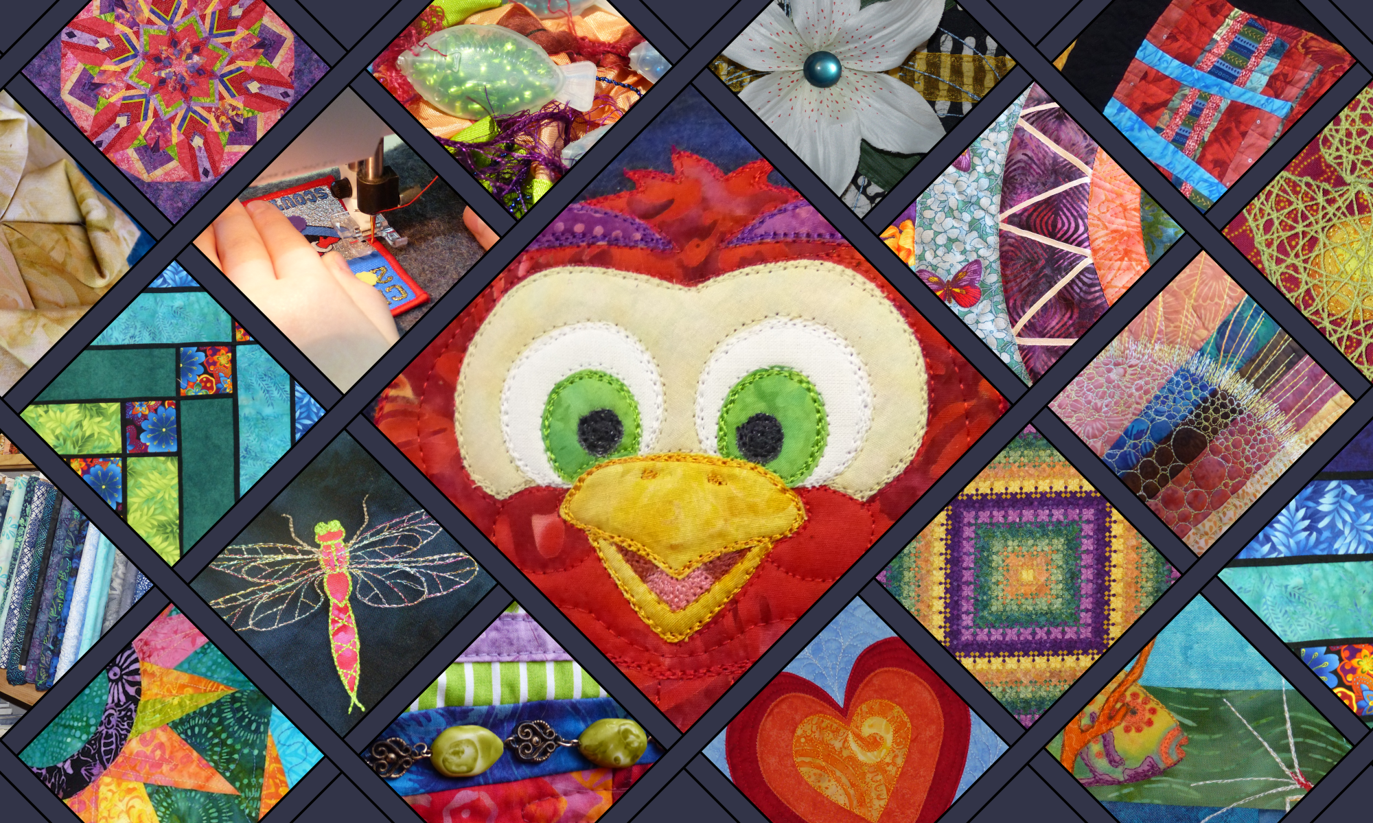
Here are some close ups of some of my favourite pieces in the Island Batik “Victoria and Albert” collection.


Lots of flowers and leaves, with a nice Spring/early Summer feel. Not all the fabrics in this collection are floral though – there are also dragonflies and lots of tone-on-tone fabrics that work well as blenders to reduce the overall busyness of the collection.

What will I make with Victoria and Albert?
In August there will be a blog hop especially to showcase quilts made in the latest fabrics from Island Batik. The purpose of that quilt will be to show off as many of the prints in each collection as possible. But, because I have such an abundance of fabric in this range, it is my intention that I will also use some of my yardage to make my Ambassador’s July Challenge quilt. The Island Batik Ambassador design brief for July is to make a quilt that features a secondary pattern. Which means a pattern that appears because of the way that multiple quilt blocks interact with each other when placed side-by-side. Maybe I could try making a traditional Winding Ways quilt? I love how the Winding Ways blocks create “circles” when they are placed en masse. What do you think….? It would be a lot of curved piecing……. but I am thinking it could look pretty good in the Victoria and Albert colours and prints.
Speaking of Winding Ways…..
I am pleased to announce that I finished my Modern Winding Ways quilt yesterday. I will tell you more about the details of that later in the week, but in the meantime, here is a photo of my finished Island Batik Ambassador June Challenge.

A facing seemed to me to be more in keeping with the modern vibe of this quilt than a binding would be. And I’m really pleased that I followed that instinct. It did make me a bit nervous, as I generally bind all my quilts, and I haven’t done a facing like this before.

But it worked out fantastically, and now I want to write you a tutorial on how I did it. Unfortunately, with black fabric it is too hard to see any detail in photos, so I will have to do another project in a lighter colour to get some decent photos to show you the steps. Edit: you can now find my quilt facing tutorial here.
So, for now, let’s have a look at the features from last week’s link party instead
Obviously, I am a sucker for funny critters that make people smile. There were several on last week’s linky if you’d like to look. But smiles don’t get any bigger than that of the Cheshire Cat! Brenda at Songbird Designs digitised numerous pictures for an Alice in Wonderland Quilt, and she is clearly a bit of a pro at it. Thanks for sharing your Cheshire Cat’s amazing cheesy grin Brenda!

The overall theme in the link ups this week seemed to me to be how changing the colours in a quilt design completely alters a pattern.

Gail of Quilting Gail probably takes the prize in this regard. Her post on her latest table runner showed the pattern in no less than 5 different variations. Head on over and decide which effect you like the best!

Not to be outdone though, Andrée of Quilting and Learning – What a Combo! has started an Epic Neutral Bowtie Quilt in colours very different to the original rainbow pattern. I really like neutral quilts and this one is shaping up to be a beauty!


And last but not least, Wendy of Pieceful Thoughts of my Quilting Life linked up her finish of a half-hexie quilt that has all the glorious colour of a stained glass window with the sun shining through! Here’s the Chameleon mimicking batiks mimicking stained glass. 🙂 Make sure you check out Wendy’s post and compare her quilt to the original design and fabric choices.

I hope you will visit today’s features. What fun! And my sincerest thanks to everyone who linked up last week. If you were featured you can find a badge of honour here.
 Now it’s your turn to share. Link up to this week’s Chameleon’s Colour party!
What are you working on, or have recently finished in your sewing room? Link up a blog post, a Flicker pic, an IG post or simply a photo from your computer. See if you can get the Chameleon to turn quilted with happiness. We’d love to see your quilting colours.
Guidelines (more detail here):
- Link up your latest or recent quilt excitement. All construction stages welcome, from a quilt plan, a fabric pull, quilt blocks, a flimsy, to a finished quilt…. if you have a photo you love, we want to see it.
- You have 100 characters in the link description…. tell us who you are and what wonderful colours you’ve chosen. Inspire us with your colour scheme!
- URLs are not necessary to link up, but if you have one, please use the direct link (not your homepage). A link back is appreciated but not necessary. Remember you can link photos straight from your computer…. non-bloggers 100% welcome!
- Do you use muted/pastel/low volume colours? Fantastic….. the Chameleon wants to see Everything, not just the bright stuff!
- Do it now……. before you forget!
[inlinkz_linkup id=786063 mode=1]


Thanks so much for the feature, Dione! That quilt was so much fun to digitize and create – and yes, the Cheshire Cat is my favorite too!!
I LOVE this new line of fabric! Victoria and Albert are definitely on my must have list!! Looking forward to seeing what you create with them!
The island batik fabric looks gorgeous- can’t wait to see what it’ll turn into. In the meantime, that Winding Ways quilt if gorgeous! Did you stitch in the “shadow” motifs? Love it.
I love this fabric, especially the yellow and blue dragonfly. My mind started racing trying to decide what I could make using it or if I could add it somewhere in the design I am working on. Thank you for hosting the linky party. One more reason to enjoy your site on Tuesday’s.
Very nice color scheme! I like the batiks with the corresponding colors on the side – a great way to work out a scheme.
Nice fabrics! I especiallyt like the dragonfly one.
Can’t wait to see the patterns you will find to use them!